Why your colour palette matters more than you think
Your brand colours are not just decoration.
They are communication.
Before someone reads a single word on your website or Instagram, they are already forming an impression of your brand based on colour alone.
Your palette influences:
- how professional your brand feels
- whether your audience trusts you
- how memorable your business becomes
- and the emotional response people have to your content
In kingdom-led, purpose-driven businesses, design is never just about aesthetics — it’s about alignment.
Let’s walk through five intentional ways to choose a colour palette that actually reflects your brand identity.

One – Define the Emotion You Want Your Brand to Communicate
Every colour carries emotional weight.
So before choosing colours, ask:
“How do I want people to feel when they encounter my brand?”
Because colour is emotional before it is logical.
Common colour associations:
Black – Power, sophistication, elegance
Blue – trust, reliability, professionalism
Purple – creativity, luxury, wealth
Green – growth, health, tranquillity
Red – Passion, excitement, strength
White – purity, innocence, simplicity
Your brand should create a consistent emotional experience.
How do you want them to feel when they encounter your brand?
If your visuals feel scattered or mismatched, your message becomes harder to trust — even if your work is excellent.
Keep in mind that colour palettes usually tend to change with time. So you may want to check after a while to see whether it still aligns with your brand personality, mission and strategy.
There are several more examples of colours to choose from. You can learn more in this great article by Helpscout about colour psychology.
Two – Consider Your Ideal Client, Not Just Your Taste
This is where many brands go wrong.
Your brand is not just for you — it is designed to communicate with someone specific.
So ask:
- Who am I speaking to?
- What do they already respond to visually?
- What kind of aesthetic builds trust for them?
Example:
A youthful, creative audience may respond well to:
- bright, playful tones
- bold contrast
- expressive palettes
A coaching or service-based audience may prefer:
- soft neutrals
- muted tones
- calming, grounded palettes
Good branding is not about personal preference.
It’s about intentional communication.
When your visuals align with your audience’s expectations, trust increases naturally.
What is the age bracket of your audience? Are they young teenagers who respond to bright, vibrant colours, or are they semi-retired couples who are drawn to peaceful colours like blue and green? It may pay to ask for feedback on your new colour choices.
You can always change and make adjustments. Remember, your colour palette doesn’t have to be set in stone, especially when you are just starting out. So have fun with it and explore!
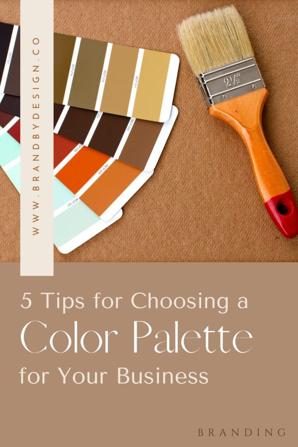
Three – Gather Inspiration, But Don’t Get Lost in It
One of the fun parts of choosing a colour palette is looking for inspiration. There are several places you can go to find stunning ideas for your brand. One of the most popular places is Pinterest where you can find just about any combination and style you may be looking for.
Other online platforms like Dribble and Behance allow you to browse colour palettes and find inspiration from a variety of sources.
Inspiration is important — but direction matters more.
You can find ideas in:
- Pinterest boards
- design platforms like Behance or Dribbble
- nature and environment
- art, photography, and architecture
- brand design studios and templates
Even creation itself reflects beauty and order — there is inspiration everywhere if you slow down enough to notice it.
A word of caution…
Inspiration without strategy leads to inconsistency.
So instead of collecting endless ideas, start filtering:
- Does this reflect my brand emotion?
- Does this suit my audience?
- Does this feel aligned with my message?
One thing I love to do is go outside and muse over the colours of nature that God has provided.
You won’t be able to help but appreciate the vastness and beauty of His creation.
Another place to find inspiration is in art, paintings, illustrations that resonate with you.
There are also online tools like Adobe Colour, Palette Generator, and Coolers that you can use to generate your perfect colour palette. Why not try them out.
If a neutral colour palette is your taste (as it is mine), then the mockups and images from Moyo Studio will be heaven for you!
They have a huge range of aesthetically pleasing images to choose from.
Four – Keep Your Palette Simple and Intentional
One of the most powerful branding principles is: simplicity creates recognition
Most strong brands don’t use many colours — they use consistent ones well.
A strong starting structure:
- 1 primary colour
- 1 secondary colour
- 1 accent colour
- 1–2 neutrals
Why this works…
A limited palette:
- improves brand recognition
- creates visual consistency
- makes content easier to design
- builds a stronger brand identity over time
There are exceptions (like children’s brands or highly expressive industries), but for most coaches and service-based businesses, simplicity creates clarity.
Try keeping your brand colours to a minimum.
Try choosing a limited colour palette as it will give you a more cohesive and consistent visual identity for your brand. This also helps to make your brand more recognizable and memorable for your target audience.
Choose one or two primary colours and add an accent colour to give your brand a bit of a pop!
Once you’ve chosen your brand colours, make sure to use them across all your touchpoints, such as your social media content and materials.
You can play with different tones and shades of colours to give yourself look that is unique and fresh.
Five – Build a Brand That Can Grow With You
Your brand is not static — it evolves as you do.
So instead of asking:
“What colours do I like right now?”
Ask:
“What colours still represent where my business is going?”
Your brand colours are not just a visual choice — they are part of your message.
When chosen intentionally, they:
- communicate trust
- reinforce your identity
- elevate your perceived value
- and support your overall brand strategy
In kingdom entrepreneurship, even design becomes stewardship — creating something that reflects clarity, order, and purpose.
To Summarise
Start by defining the emotion you want your brand to communicate, then select colours that align with your ideal audience and brand personality.
Most brands use 3–5 core colours: one primary, one secondary, one accent, and 1–2 neutrals.
There is no single best colour — the right palette depends on your audience, industry, and brand message.
Colour influences perception, trust, and emotional response before your audience even reads your content.
If you are ready to choose the perfect colour palette for your business, then download my Free PDF ‘Colour Your Brand’!
You’re sure to find something to inspire you!
READ & LEAVE A COMMENT
SHARE